- New Business/Supporthello@adamscreation.com


Re-orienting brand visuals to create emotive, lasting identity

Overview
Kenza TMT needed no introduction. With over 28 years of excellent service and quality to vouch for, the company stood strong as a reliable choice for the masses. Infact, over the years it has grown as a socially committed organisation, another badge to add with its impeccable record of product excellence.
If anything, what hindered Kenza’s subsequent objectives was that it perhaps lacked the lustre to lay its stamp pan-India. Much like a trusted baker round the corner of the street, Kenza held its reputation around the region it thrived in.
In order to expand, appeal and make it itself known to the younger generations, it needed a slight polish on the rough edges and a new, youthful trait to work on. Kenza’s rebrand was essentially retaining the golden bits of Kenza that the consumers associated with and adding a punch of emotional orientation to the brand to strengthen its identity in the coming years.
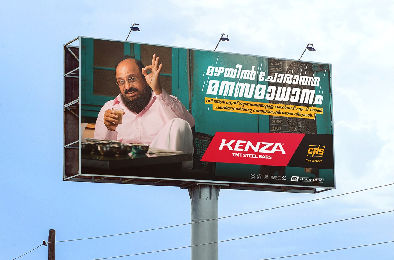
Kenza TMT laid the cherry on the cake with a campaign that was made to induce the feeling of trust and reliability. The team conceptualised TVCs to introduce the company as a friend of the common man - a change from the existing version of the brand ambassador that portrayed a rather elite face of the brand.
To be seen as affordable and the choice for all, the TVCs were thus moulded with a reliable, household-trope of a spokesperson. A common voice reaches the common population. WIth the re-brand, Kenza TMT achieved just that.
Video credit: Dos Caminos Picture Company

Delivered
- Rebranding
- Brand Guidelines
- Campaign Strategy
- Visual Language
- Brand Application
- Product Label design
- Print Marketing Collaterals
Discuss a Project
Want to work together on a project?
Drop us a message and we shall get back to you